Putting together a dashboard seems easy enough, right? You would think that dragging and dropping your visuals into a Tableau dashboard would be the easiest thing in the world until your charts start appearing in places you don’t want them to or shrink in places you don’t need them to. No matter where you try to drag your visual onto your canvas, it just does not appear the way you want it to.
Floating containers are one solution in which you can set the dimensions of it the way you want it. But, floating containers are not fast and don’t scale as well as tiled containers.
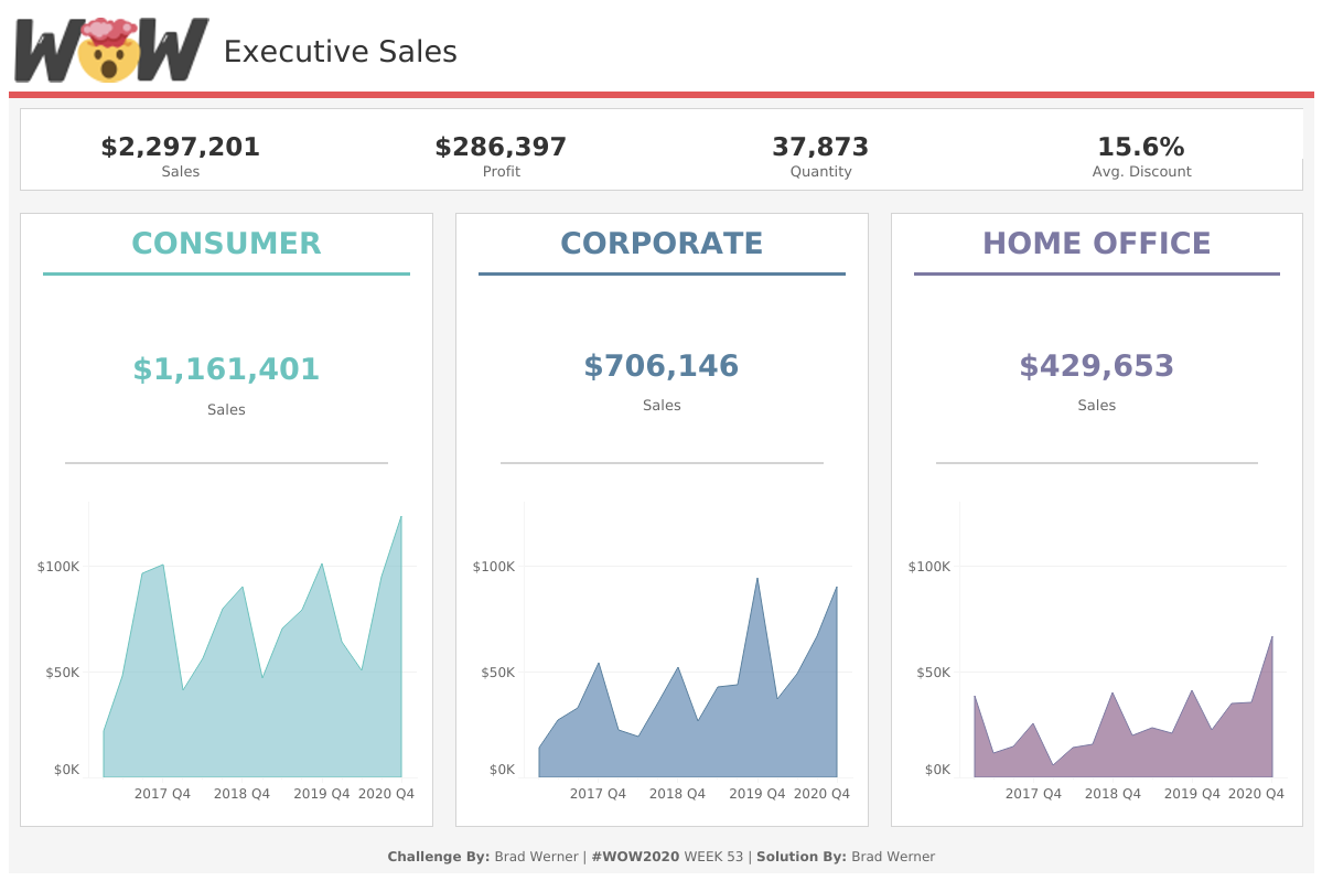
Tableau feels that it takes much longer than it should create a dashboard because containers seem to have a mind of their own. This Workout Wednesday helps show how simple it can be, creating a beautiful, simplistic dashboard with tiled containers and creating white space using inner and outer padding.
My dashboard for the challenge is below; please feel free to download the workbook from Tableau Public or contact me if you need help with how I got to the solution. Also, here is the link to the original challenge, posted on the Workout Wednesday website.
