
Welcome to Workout Wednesday
In an attempt to sharpen my data skills even further, I have come across a challenge, concocted by some of the best data minds around the world, that looks to put my brain through an Ironman triathlon. Welcome to Workout Wednesday.
Taken from their website, Workout Wednesday is described as a “weekly challenge to re-create a data-driven visualization. The challenges are designed to grow participants’ knowledge of Tableau and help kick-start personal development.”
The challenges put forward every week looks to challenge everything I know about using Tableau. From the looks of the challenges from previous weeks, some of the techniques asked of you here are more advanced than anything you might get out of taking basic training on Tableau. This is why it is the perfect challenge for anyone new to using Tableau, someone like me who has been using it for a couple of years for work, and even the veteran of Tableau, who has been using it for 5+ years.
Challenge for Week 17 – Calculate Run Rate Using Weekdays
Week 17 of 2020 is my first endeavor into the Workout Wednesday challenge and it may be a familiar one for anyone with a finance background. This week’s challenge was to re-create a dashboard which calculates month-to-date sales and a run rate based on using only weekdays. Calculating the run rate using only weekdays proved to be a good challenge that is not as straight forward as it may seem. The data was put together by Meera Umasankar and you can find it here.
What is a Run Rate?
For those of you not familiar, a run rate is a way to forecast future earnings (or in the case of this dashboard, future sales) over a period of time, based on previous earnings. For example, if company A makes $10,000 in one month, the annual run rate would equal $120,000. The run rate would boil down to the calculation below:
Earnings in X Period * # of periods X in one year = Annual Run Rate
For more information regarding run rates, refer to this article from ProfitWell.com.
For this dashboard, we are tasked to calculate a monthly run rate based on how many weekdays there have been so far in the data set and the total number of weekdays in a given month. The data set provided to us has sales data from April 1, 2020, through April 23, 2020. We are essentially trying to find how much sales are made per weekday, and projecting how much sales we will make for an entire month. Given this goal, we can derive a calculation to find a monthly run rate:
(Month-to-Date Sales / Number of Weekdays So Far in Month) * Number of Weekdays in Month = Monthly Run Rate (Only Weekdays)
Because we are using only weekdays, to get to the final solution of the dashboard is a little bit more complicated, but nothing we can’t handle, so I am hoping I can explain to you the steps of how I got to my solution. But first, let me lay out the requirements of the dashboard put forward by Meera.
Dashboard Requirements
The cool thing about the Workout Wednesday challenge is that everyone should have a dashboard that looks the same, but the way we reach the solution is up to the analyst. There are guidelines the challenger sets to push the analysts in the right direction. The guidelines for this week’s challenge are as follows:
- Dashboard Size: Phone Layout
- # of Sheets – 1
- Create 1 sheet
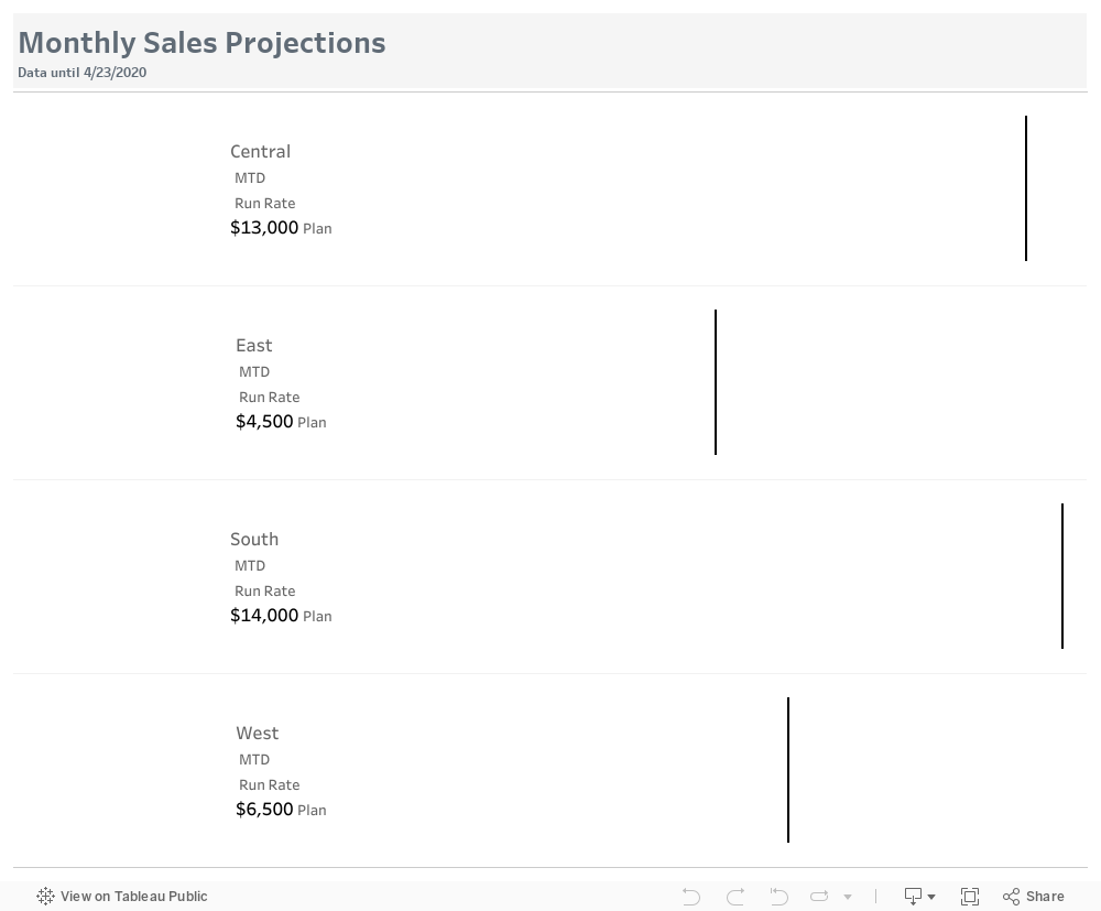
- Show Region, MTD Sales, Run Rate and Plan as text on the left
- Show Run Rate as a bar and Plan as a line on the right
- Calculate MTD – Month To Date
- Calculate Run Rate – (MTD/No. of days so far)* No. of days in a month. Be mindful to use only weekdays in your calculation
- The color of the bar is based on the Plan. If the Run Rate is less than Plan then its a Red
- Do note that Plan number is a monthly plan whereas your other fields are daily
- Formatting for the numbers on the left
- Font: Tableau Medium; Size: 12;
- Color: Plan – #000000; Run Rate if less than Plan #e03426 else #606b76
- Title – Font: Tableau Medium; Size: 20; Color: #606b76
- Finishing Elements
- Create a title with dynamic data until date field
Again, these are guidelines you need to follow to re-create the solution. Items like color, font, and size are pretty straight forward, but the way you calculate month-to-date sales, number of days so far, and number of days in a month for the run rate calculation is entirely up to you.
Re-creating the Solution
Define the Sheet Layout
Taking a look at the dashboard created by Meera and taking note of the requirement to have only one sheet, I knew the text on the left-hand side of the chart and the bars needed to be on the same sheet. My initial thought was to drag the Region dimension to rows and somehow create separate labels for the MTD sales, run rate, and plan measures that fall below the Region, but that isn’t possible.
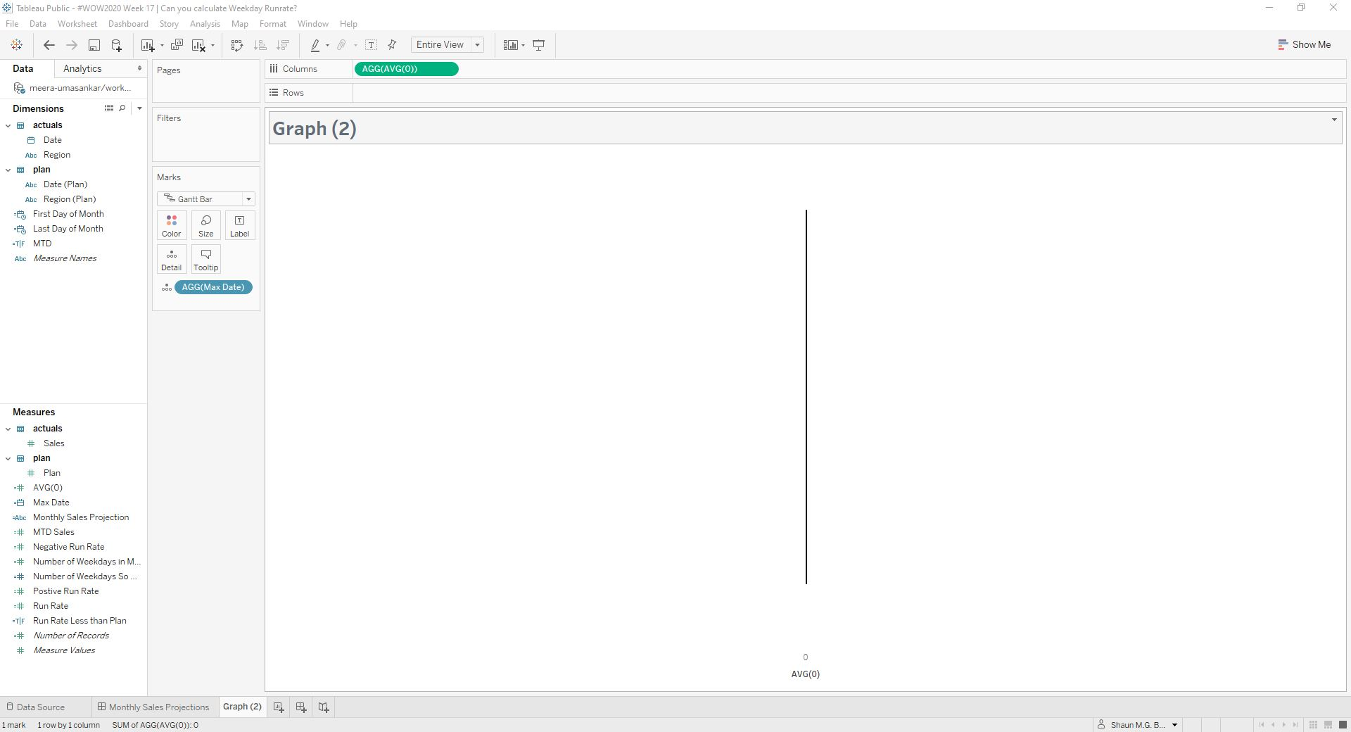
I remembered another dashboard I created in the past in which a bar chart was created to show bars on two separate sides of a y-axis. The layout of the challenge dashboard is similar to that, in which I need to put text on the left side of the y-axis, while the bar charts need to go on the right side of the y-axis. This can be achieved by creating a calculated field AVG(0). From the picture below, you can see by dragging this calculated field into columns, it creates a solid line down the middle of the sheet. This creates the border between the text on the left and the bars on the right.
Create the Calculated Fields
To calculate the monthly run rate, we need three different measures:
- Month-to-Date Sales
- Number of days so far in the month
- Number of days in the month
Month-to-Date Sales
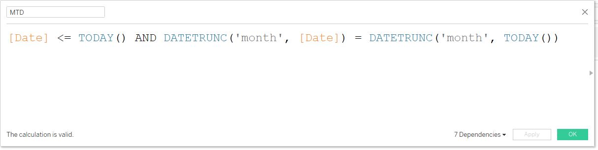
We’ll start by calculating the month-to-date sales. To determine if a given date is within the month-to-date range, we will create a MTD calculation that determines if a given date from the data set is less than or equal to today’s date and the month of the given date is equal to the month of today’s date. Based on if these criteria are met, a true or false value is given.
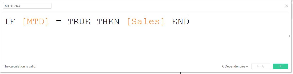
Using this newly created MTD calculation field, we want to create a new calculation field, called MTD Sales. To calculate the MTD sales, you use the formula: IF [MTD] = TRUE THEN [Sales] END. As a result, this will give the sale numbers only if the dates within the MTD calculation are true.
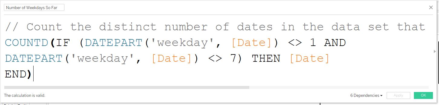
Number of Weekdays so far in the Month
We need to determine how many weekdays there are so far in the month. To do this, we just need to count the distinct dates that are weekdays. Since Sunday is equal to 1 and Saturday is equal to 7, we can use a combination of an IF statement, along with a date part function to count the dates not equal to 1 or 7. Therefore, the calculation will give us 17 (4/1/2020 to 4/23/2020).
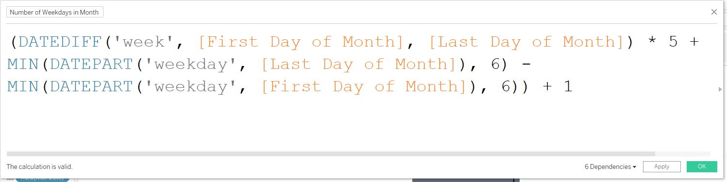
Number of Weekdays in the Month
Finally, to figure out the monthly rate, we need to calculate the number of days in the month. This calculation consists of three parts: A DATEDIFF function calculating the number of weeks between a start date and end date, multiplied by 5 (number of weekdays in a week), a DATEPART function, which gives you the weekday number for the last day of the month, and another DATEPART function to get the weekday number for the first of the month. For an in-depth explanation of each element in this calculation, look at this article by Jon Bajon at Interworks.
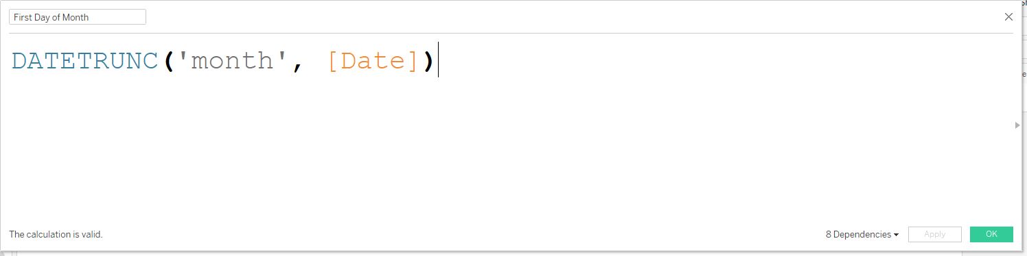
Before creating the calculated field above, we will create two more calculated fields for the first day and last day of the month. The first day of the month calculation is easy enough. We just need to DATETRUNC the date dimension by month, which will give us 4/1/2020.
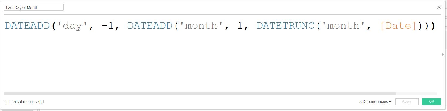
Lastly, the last day of the month calculation involves adding one month to a truncated date (4/1/2020 becomes 5/1/2020), then subtracting one day from that date, resulting in 4/30/2020. We now have the elements to complete the calculation for the weekdays in a month.
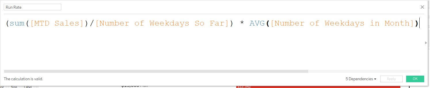
Run Rate Calculation
Now, we have the three elements needed to calculate the monthly run rate using weekdays only. Using those three elements, the picture below shows the calculation to determine the monthly run rate. Using an average for the number of weekdays in a month gives us the desired number. A sum takes the number of weekdays multiplied by the number of records. Taking an average will get us the correct number.
Calculated Fields for Formatting
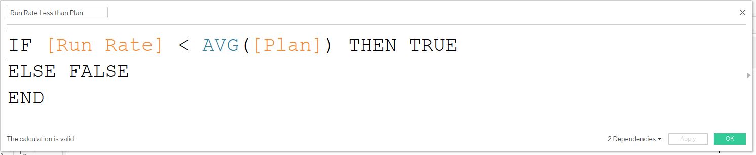
Run Rate Less than Plan
Before putting all the elements together to create the dashboard, we need to create a few more calculated fields. We are required to make the bars in the chart two different colors depending on if the run rate is less than or greater than the plan number. To do this, our calculation will check to see if the run rate is less than the average of the plan. If it is, then give us a true value, and if not, give us a false value.
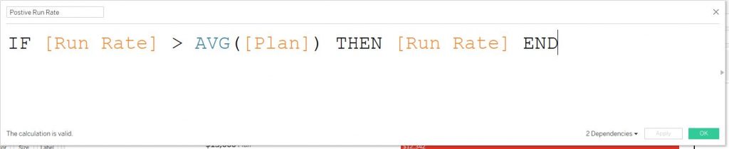
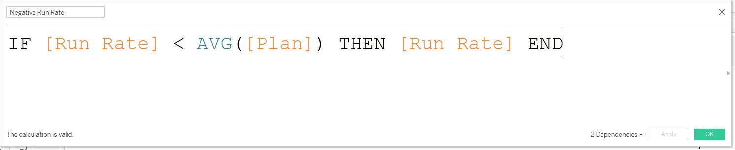
Positive Run Rate and Negative Run Rate
The next two calculations are needed to change the color of the run rate text to match the color of the corresponding bars. The positive run rate shows the run rate if the run rate is greater than the average of the plan, while the negative run rate shows the run rate if it is less than the average of the plan.
Max Date
Lastly for the calculated fields, to change the date in the title dynamically, we will create a max date measure. To do this, create a new calculated field and put MAX([date]) into the box.
Putting it All Together
Creating the Bar Chart
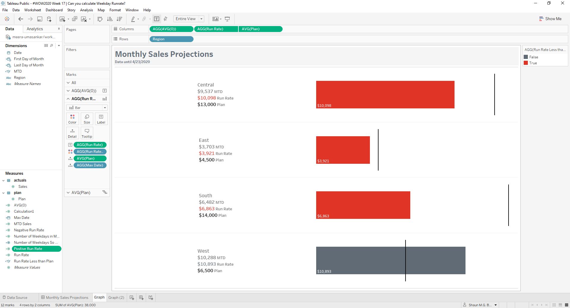
Finally, the last part of creating the solution is to put all the elements onto the sheet and into a dashboard. We have the initial setup from creating the AVG(0) calculation, where the sheet is split down the middle by a y-axis. Now, next to the AVG(0) measure in columns, drag ‘Run Rate’ and ‘Plan’ to columns and Region to Rows (make sure to change ‘Plan’ measure to an average). This will create four different bar charts for each region along
Next, under the marks cards:
- Change AGG(AVG(0)) card to text
- AGG(Run Rate) card to bar
- AVG(plan) to Gantt Bar
In the AGG(AVG(0)) marks card, drag region, Sum(MTD Sales), AGG(Positive Run Rate), AGG(Negative Run Rate), and AVG(Plan) to text. Next, click on the text box to get to the edit label screen. The text should be in the format of the screenshot below.
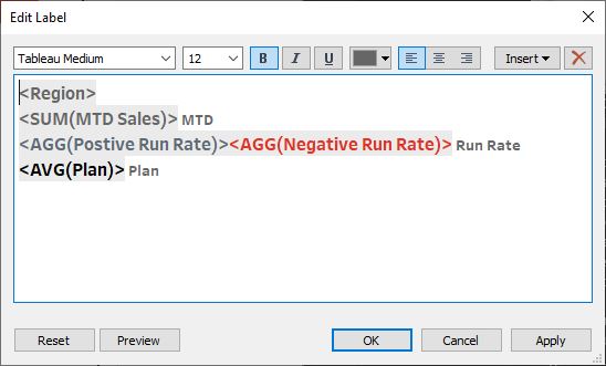
Next, in the AGG(Run Rate) marks card, drag AGG(Run Rate) to text, AGG(Run Rate Less than Plan) to color, and AVG(Plan) to detail. For the Run Rate Less than Plan color, according to the requirements, the true values will use color #e03426 and false values will use #606b76. The last measure we will drag into the sheet is the Max Date, which should be dragged into the detail of the ‘All’ marks card. We can now hide all the headers on the x-axis and remove any gridlines, except for the row dividers.
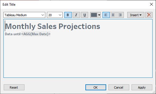
We will now create the title with a dynamic date. Following the formatting requirements provided, create the title and insert the Max Date measure into it. Below is what the final sheet should look like.
Creating the Final Dashboard
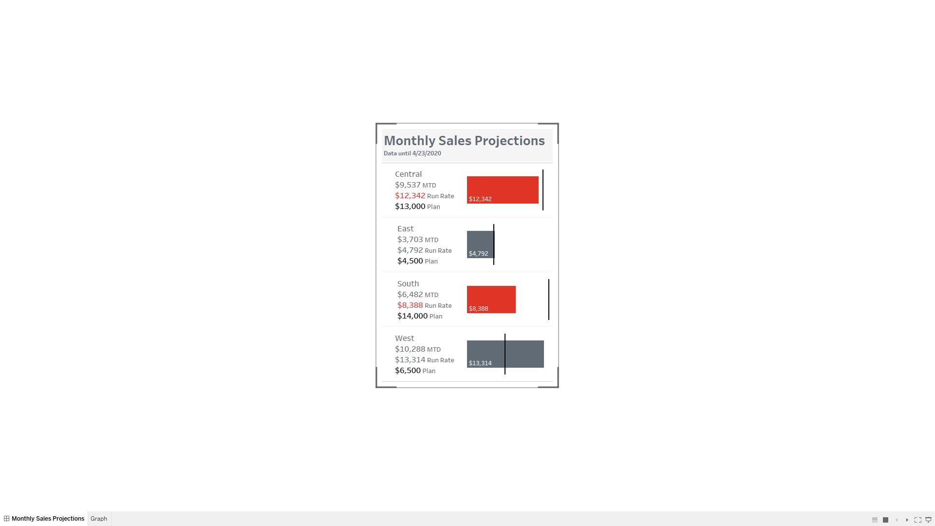
The final step now is to create the dashboard. This should be the easy part. First, set the default dashboard size desktop browser (1000 x 800). Then, create a phone layout, set to the generic phone size. Set the size to fit all.
Congratulations!
Great job in re-creating this week’s Workout Wednesday challenge! For my first challenge, I’m glad I was able to reach a viable solution and I hope this guide helps you in your quest to become a Tableau Master! I hope to solve more challenges and providing my insights in the future.