Category Visualizations
Putting together a dashboard seems easy enough, right? You would think that dragging and dropping your visuals into a Tableau dashboard would be the easiest thing in the world until your charts start appearing in places you don’t want them… Continue Reading →

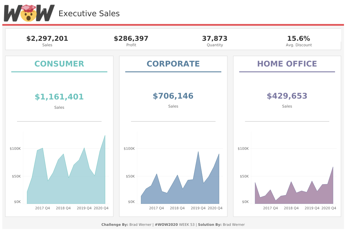
Welcome to Workout Wednesday In an attempt to sharpen my data skills even further, I have come across a challenge, concocted by some of the best data minds around the world, that looks to put my brain through an Ironman… Continue Reading →
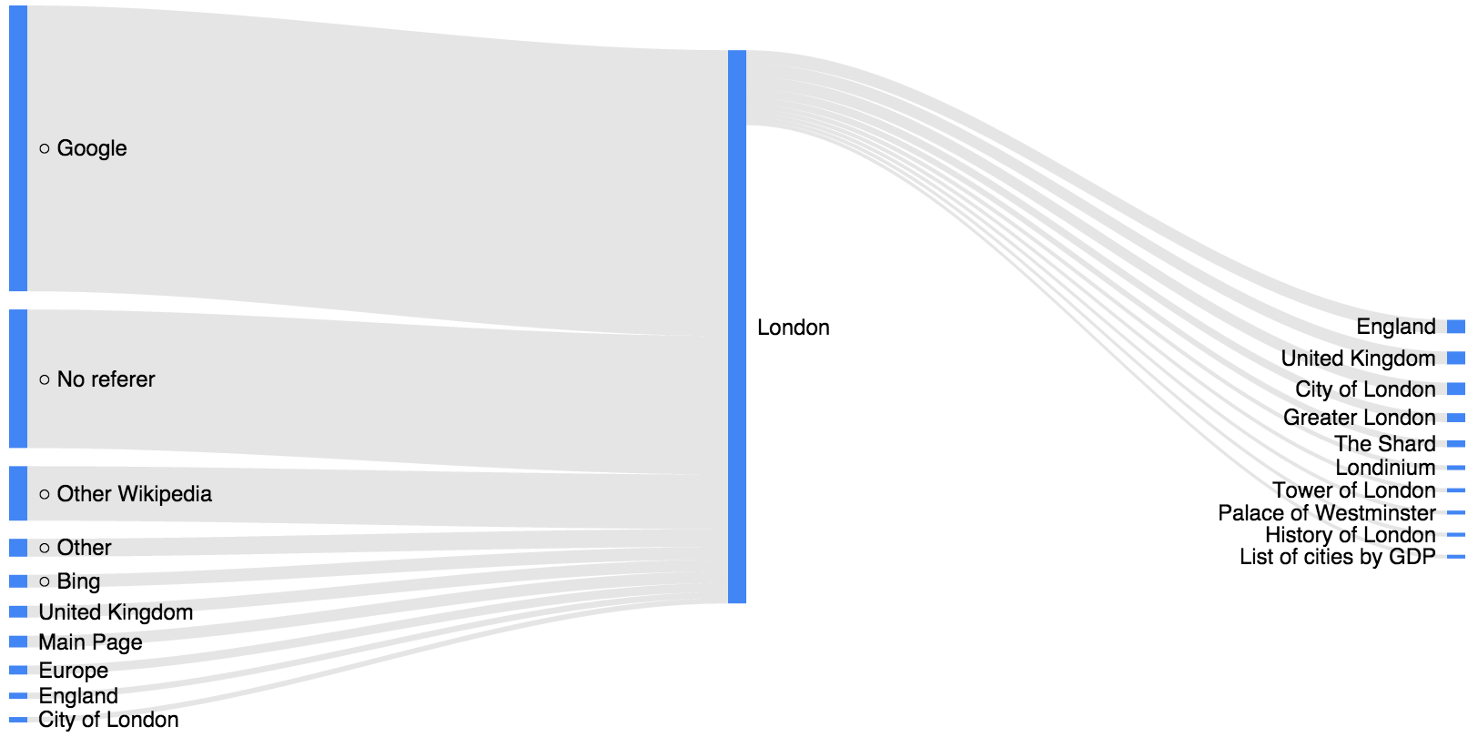
Sankey Diagrams are one of those charts that people never knew they wanted or needed until they’ve actually seen it. That is very unfortunate because when used correctly, a Sankey Diagram can provide an eye-catching visualization that provides great insights… Continue Reading →

When working on a dashboard in Tableau, as the creator, we want to make it so anyone can be able to navigate the dashboard as easily as possible. Basically, we want to create it so the user will have no… Continue Reading →